Blog Archive

Friday, 26 July 2013

Exam

For the media exam you have 4 tasks which all are 15 marks each 60 marks all together.

  • Task 1 is usually about it will become a success
  • Task 2 is just your pitch
  • Task 3 is about how you can do things 
  • Task 4 is your practical exam

All of these tasks will be present but sometimes the exam board might change the structure so that Task 1 is changes to the second question  and so on but the fundamental parts are usually there for our exam we focused on the magazine industry as you can see from the exam question I posted previously.Remember that media is 60 percent coursework so your coursework will really influence your final scores.Therefore If you work hard in the coursework you will be guaranteed a good grade that can help increase your final grade.

Tuesday, 30 April 2013

Exam topic

In class we finished all our coursework and started focusing on the exam topic.Task 1,2 and 3 question after a lesson of practice here is my attempt typed up for you.

We think the most important ingredients to a successful music magazine or website are the following:
·         An opportunity to interact with fellow fans and bands/artists
·         Video and audio content
·         A clear target audience
Why are these important elements for a successful music magazine or website?
(15 marks)
It is important to create an opportunity for the audience to interact with fellow fans and band artists as it makes them feel part of a group and society. So they feel like they belong in a group and are not particularly alone. Many magazines use this interactivity from magazines such as metal hammer and just pop. However I want to use interactivity in an entirely unique way. As most people are put off by doing long competition only to realise you have lost and don’t have the chance to meet the artists/bands. Therefore I am just going to create a new type of competition were we get audiences to submit themselves singing to get feedback and gain popularity and even if you don’t win votes and get to meet surprise stars you have still got something out of it as you get the satisfaction of other talking about you in forums and basically getting a word of mouth advertisements as people advise others to watch your videos or audios.
Also I believe that video and audio content is important and to carry on from what I said previously on audience submissions I chose to mix in some user generated content, video and audio content and interactivity to get the most of the web 2.0. However similarly to Kerrang and I love pop I also did add some videos into articles so they can actually see the event take place and I also used a lot of audio and video content in my Rhymix radio just like K! Radio I created top 10 pop songs as I am doing the pop section of the magazine. I believe it is important as it helps you see exactly what’s happening making them trust our publishing company as we provide picture, audio and videos back up all our stories and also to help people submit their own songs to motivating them interact with other fans . Therefore I believe that audio and video content helps create a chance of interactive as they could comment and vote on different videos and so on.

In addition to this I believe that it is important to have a clear target audience as it dictates the style of writing, colour scheme, logo and many more. So without having a clear target audience the magazine cannot earn any profit as it doesn’t really have a target audience. All magazines have a target audience for example Kerrang describes their reader as morally aware, music orientated and their lifestyle reflects their musical preferences. They also have an audience with a main age of 22. They reflect this information throughout their magazine as they acknowledge the fact that their probably in education and also have an understanding of the type of person their target audience is. This is why I personally believe that to be a successful magazine you have to have a target audience in mind as no magazine has ever succeeded without one

Pitch us your ideas. Tell us about your online magazine? E.g. Logo, slogan and style, colour scheme, tone, content, featured stars and artists and target audience
(15 marks)
Thank you for taking into consideration my pitch for the launch of Rhymix.as I like your idea to have an online music magazine that will be a hybrid genre and contain lots of different well known genres in the music industry such as Rock, Grime and Rap. I am excited to use this opportunity to use my passion for pop to contribute to this unique venture. My slogan is “Different people like different music” emphasises the fact that Rhymix is tailored to fit different genres and satisfy their musical preferences. My logo is different dependant on what section of the magazine it is. Therefore my logo emphasises the fact it’s the pop section of the magazine I manipulated the fact that as well as a genre of music pop is also considered to be onomatopoeia so I drew a jagged borderline with the word pop inside to give two interpretations of the word. The pop section is the section will specialise in as it’s a genre that I know a lot about and that’s the genre that I will portray in the drawing of my online magazine.
The style and tone of the my magazine in general is just happy, excited and interested in the pop genre so we can relate to the young target audience of 10 to 19.I chose this young audience as the establish stars that are featured are people like Justin Bieber and One direction and so on which have a young average audience. Like revolutionary publication we are also used it as a chance of discovering new music and talent as we feature new rising stars as well as informing people on the general pop culture. The colour scheme will be bright colours such as purple, yellow, pink, orange and green to reflect the fact that our audiences are bright and bubbly. But not that much as if it’s too bright it can become nauseating to look at so I used it to highlight specific details so the white spaces calm down the aluminous colours.
After conducting extensive focus groups and market research I have decided to add in different sections in the pop section of the online magazine such as the other pages and contents. For example the Home, Contacts, News, Reviews, Interviews, rising stars audience submission, twitter feeds and Rhymix radio tabs. I chose to change the contents by making it more interactive and more user generated by adding in audience submissions which are videos and audios of our audience displaying their musical talent giving us a chance to discover new talent we also have forums to discuss which one of our audience submissions are the best the winner then goes to meet a surprise star that we change monthly. We also connect it to social networks such as twitter by creating a section named twitter feeds from all our audiences. As well as Rhymix radio to make use of the web 2.0.s interactivity.

I chose to target a young audience of 10-19 as it’s a pop genre. This genre usually appeals to young predominantly females audience. Who are usually obsessed with pop stars such as Justin Beiber and One direction. They also are more likely to transfer from pop magazines such as I love pop and Just pop to our magazine as the older the audience get the more informed they want to be and an online version is considered to be more convenient as they get information instantaneously. Since they really admire their pop stars they will subscribe and hopeful be loyal to our company as we not only tell them about stars that they know but new stars that they can watch blossom into the international superstars they really are. We also try to focus on talent rather than advertising already established stars as we are more talent focussed.

How would your page make money for the Rhymix website?
(15 marks)
Even though it is tough to earn a fair amount of money in the music magazine industry I still firmly believe that the fact that it is an online magazine will benefit me greatly as unlike other print magazines I don’t have to pay much to produce glossy pages with high quality photography. This is why I believe that we could use the internet to keep the music magazine industry alive and by doing this we could gain lots of profit as we tell readers what they want to know. Who doesn’t want to be informed in what happening in the interesting Hollywood life of big stars such as Taylor swift and Katy Perry? The truth is that the prices of this are incredibly off putting if you can just Google it online. So at first we won’t make that much money as we want the Audience to grow and become loyal to our company. So we can start creating memberships later on and we can also give them a chance to switch to our radio as it plays their favourite pop song.
After we gain a fan base Rhymix can make money through subscription and membership. Some print magazines rely on a high cover price in order to cover cost of publishing and distributing. However this makes them gain fewer customers as most customers are not prepared to spend a lot of money for their media consumption. However publishing companies such as future take the risk of losing readership rates in order to earn a decent profit. We know this as they sell the magazines at a hefty price of about £8.00 pounds for their magazine classic rock. Therefore we could take a leaf out of their book and have expensive subscriptions or membership charges to show that we want to make money but we can’t as our audience are young and are more reluctant to pay so much money and we will have a low readership rate which is quite risky. Instead of this we would find balance between cost of subscription and member ships as well as the amount of audience that are loyal to our company.
So instead of taking this risk I am prepared to lower this subscription charges and membership by making money through advertising products. This is the techniques used by publications such as Bauer as they put a low price on purchasing or subscribing Kerrang in order to create a loyal reader to increase readership rates. This then helps to increase the amount of companies willing to feature in their website as they know that many will see this advertisement. This is how secures 3,000 for full page adverts in their magazine they have about they also have side ads and top ads to help also earn money as they advertise products in their online magazine as well. So as well as earning some small amount of money from subscriptions and member ship we will also make sure we earn lots of our money through advertisements similarly to Kerrang. So instead of losing customers with high costs of subscription and so one we will use Kerrangs idea of finding a balance and rely on companies to pay to advertise on our online music magazine


Saturday, 15 December 2012

Assignment 2 : Production planing

Genre :
Romantic Fantasy
Name :
Infernal devices
Tagline :
A curse as well as a blessing
Unique selling point:
Based on New York best selling author Cassandra Clare's novel.
Photoshop plan:
In the front cover we will have a girl  that seem to be walking backward so you wont see her face to create a bit of curiosity.The actors will be students that look pale and vampire like.I would do this by the use of light make up.The title will be swirly and mysterious and put .The tag line will be put under the title.the image will be taken in.the picture will be at eye-level we will make the main character be a student that my audience will relate to and maybe sympathize.The image will be a medium shot so you can see the characters from top to bottom this will help the audience learn a bit about them through their body language and .The location will be irrelevant because I will use an elegant background.the story is set in
The storyboard planning:
I will introduce the location with a establishing shot.It will contain camera shots of mainly close ups to create a connection between the characters and audience.I will manipulate with camera shots to trigger emotions and to help them understand the storyline. It will have fast pace editing to help increase the suspense of the end storyboards where I will use a rhetorical question to get the audience curious making them want to watch the film.The last few storyboards will also tell the audience about the release date, film companies,directors,producer and executive producers.


Friday, 7 December 2012

Analysis:Films

In class we looked at the poster and trailer for films for 4 different films.

Film 1:Avatar
Trailer:
The trailer uses a voice over of a character to avoid the use of cliché Hollywood voice-overs. This use of voice-overs is also more modern.start of slow and then the editing becomes fast as we see some action taking place.The music also changes as it get louder,slow and sometimes faster.this helps set the scene.The trailer tells us the production company and uses James Cameron to advertise because no well known actor is featured.It also tells that he has directed terminator titanic and other film this gives the reader some insight on what to expect with this film.this may cause to want to see the films created by James Cameron because they may have liked his past films.

Poster:


Avatar is a adventure/fantasy sci-fi film.The poster uses the colours blue and black to give as a mysterious feel.The use of colour intensity and light makes sure the avatar is not to scary to prevent misleading the audience.the fact that it doesn't give to much away makes you feel curious about what the film storyline really is. The use of the phrase from the director of titanic make us feel that this film will be as successful as titanic.Making the reader think that if they liked titanic they would like avatar.Therefore the film seems to use star power of the directors successful film to get a target audience.The poster doesn't tell you anything except the fact that it is directed by the director of titanic.this makes you automatically assume that it may be like titanic.This makes you want to find out more.


Film 2: she`s the man
Trailer:
Throughout the trailer they use a range of voice-overs from characters and a Hollywood cliché voice-over.The trailer starts off with graceful ladylike music then the music changes as she get in telling us bit about her personally. The representation of women on the trailer are stereotypical fashion conscious and girly.This under representation of women is shown throughout the trailer.However Viola (Amanda Bynes) is not portrayed like this she is shown to be a bit of a outsider.Conversely the male characters are shown to be dominant and manly.The film uses the storyline to engage the reader using the narration of a Hollywood voice over. it also gives the names of the actors to help advertise the magazine.the trailer contains funny and best scenes in the film to catch the audiences attention.


Poster:

The title of the film"she`s the man" is ironic and sarcastic statement which relates to a comedy genre.This tells us that comedy is a big factor in the film.Also,the bright and bold colours also relate back to the comedy genre.Giving us a further indication of the genre.In the central image they wear bright colours to add more colour to the white background.All the actors have different poses this may reflect their personality.The fact that the main character sands in front of all of them tells us that she is the main character.
At the top of the poster they give a name of a well known actor.The words are in a red coloured bold font.They chose a well known actor to star in a film more audiences are likely to watch it.
The tag line"Everybody has a secret..." makes the audience feel curious and to want to know the story line. The background of the poster is faded letters which tells us a bit about the story line. The words "want","likes" and "dating".This tells us that the story line also involves aspects of romance.This also helps liven up the white boring background.

Film 3:Titanic
Trailer;
This trailer uses some character voice-over but mainly uses words in the trailer to put across ideas.They use typical type of love music the music gradually gets loud and bells start ringing as music lyrics start.Then they uses characters voice-overs to emphasize the ending. 


Poster:
The title is a recognized name of a ship which sank.the font of it is white to stand out in the dark colour of the bout.it is quite elegant in order to reflect the time period it was set in.this trailer shows a central image of a man and a woman that dominates most of the poster.this tells us a bit about the importance of their role.their names are on top of the poster because they are famous actors which are known and recognized by many.this also makes it clear who the actors are.the ship is pointed upward to direct us to the central image.The image also indicates the film is about a love story.In the image they seem like they are blending into the sky making it seem quite romantic.The tag line nothing on earth could come between them tells us that something may be preventing them from pursuing a relationship.The colour scheme has a classical feel to it so does the font as it links in with the theme of the film.the target audience males and females,but females may be more into the romance film.the age group varies from young teenagers to older audiences because they may relate the characters and even time period.

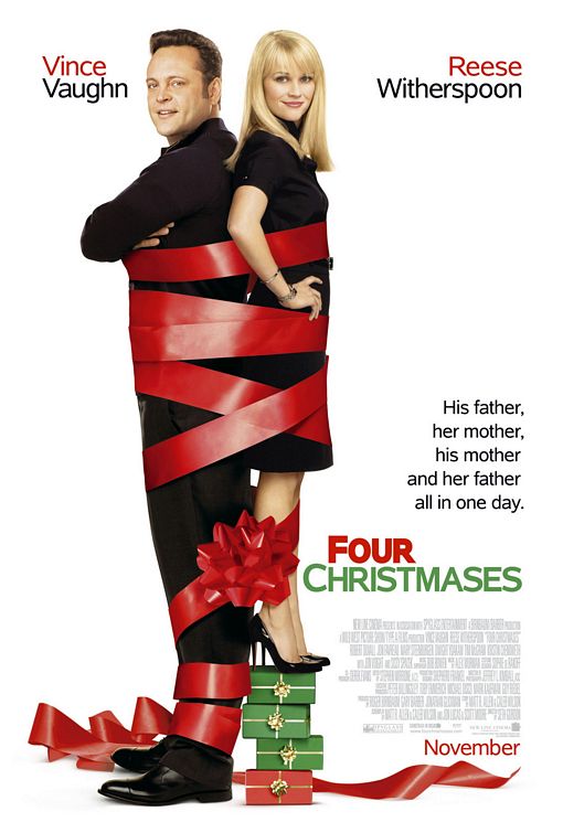
Film 4:Four Christmases
Trailer;
the film uses lots humorous scenes to gives us an idea of the genre.it is also about because it portrays the obstacles you have to overcome to sustain a relation ship the producers used voice-overs in order to tell us about the narrative.it also advertised the main actors Vince and Reese.it also tells us the release date and title it doesn't use too much text to bombard us with too much information.


Poster:
Four Christmases Movie PosterThis is a Christmas themed romantic comedy I know this due to the use of actors used. I usually see Vince Vaughn in comedy film and Reese Witherspoon in romance film this use of actors gives the reader an idea of the film genre.the use of text on the  top with the actors names tells us that they are the main stars of this film.even without watching the film I can tell that the actors are in a relationship.the fact that they are standing back tells us they don't always see eye to eye.the use of the colours red and green fits in with you a Christmas theme.The release date is at the bottom and uses the same colour scheme as the poser it uses a medium font in order to make sure it doesn't attract attention from the significant details. their is also information about companies,directors actors writers,producers and so on.this text is put in  dull grey colour that fades into the background.this makes the text seem unimportant in comparison to the other texts.the poster also uses tagline that is repetitive.This use of repetition and a long tagline suggest that the task may take a very long and be tiresome for the main actors.


Sunday, 25 November 2012

Film production analysis

Analysing genre 


I chose the film 'The vow' because it contains the typical romantic drama element.The genre of he 'The vow' is a hybrid genre.
I came to this conclusion because it contain the convention for a romantic drama.For example romantic music,romantic scenes,conflicts and drama.There are also references to love and marriage
The most obvious sign that it is a romance film is the fact that the story is focused mainly on the development of a romantic relationship between two characters.The plot also revolves around an obstacle which prevents love between two people.
Thus,making it a romantic drama.The main characters Channing Tatum and Racheal Mcadams are usually seen in this genre of films. Therefore the cast also give us a insight on the films content.The romantic music sets the scene for romance and it is also set in a season valentines day in order to get people in a romantic mood.

Analysing representation

The film producer uses representation features throughout the trailer. He gives one representation of foreigner. This representation is neutral as he portrays them as they are portrayed in the media..Making the action film seem more realistic.The foreign actors use an accented English to let the audience know that they are foreign.The film, Rush Hour is constantly critiqued as being "racist." Many viewers think Chris Tucker's jokes and Jackie Chan's follow stereotypical view portrayed  in the media of a black and Asian man.It also gives us a view of how France views Americans.

The action film  stereotypically sexualises women.Throughout the film the women are not wearing much clothes.This follows the convention found in an action movie.this under representation causes women to be more likely to be depicted wearing sexy clothing and referred to as attractive in comparison to male characters.Although women are sometimes shown with independence in a movie .they are still portrayed as objects to lust after.They are often the focus of the male gaze with camera effects, mise en scene and use of sound to accentuate their appearance.

 Jackie Chan is portrayed as a a typical hereo because he carries the conventions needed bravery,pride and strength.However he is not a typical British and American hereo. The fact that the movie manipulates with this convention in order to entertain us with humour. They do this by following the stereotypical views and opinions.They then interpret the Chinese man as someone who is good at martial art and also behaves in a dutiful Asian man.On the other hand John Carter is shown to be a Micheal Jackson  loving typical black american.This culture clash causes it to be quite humorous.

Friday, 23 November 2012

Assignment 1:Production task

For my production assignment we made a magazine which comes free with the I newspaper.The magazine I created here is made with the rule of thirds and visual centre in consideration. I also used many magazine conventions.


Throughout the magazine I used lots of magazine conventions such as.
Title of publication.
Slogan.
Flash.
Cover image.
However I chose not to add  the bar code due to the fact it is a free magazine.

Wednesday, 17 October 2012

Coursework Introduction

   Magazine analysis


The title is written in a bold colourful font. The title "lucky" suggests that they believe they may tend to draw good luck. It may also suggest that we are lucky to have such a good magazine company. This title can mean many things depending on how you individually interpret the title.
The slogan is short and sums up the magazines content. It automatically informs the audience that the magazine talks about shopping and style related topics.
The main focus of this magazine is the central image. The picture is large so it easily grabs the reader attention. Amanda Seyfried facial expression is friendly and inviting. The fact that she is looking straight ahead makes it feel even more inviting because she is directly addressing the audience.
The use of fonts make it seem very formal this suggests the magazine is aimed at older teenagers the layout is quite obscure due to the variety of font used however it seems engage the readers interest. The font is manipulated in order to highlight specific points. For example some of the fonts boldness and colour is changed for effect and emphasis.
The magazine has uses a good consistency of colours giving it a professional gloss. It uses 4 colours throughout the magazine cover. The colours used are red ,grey ,black and white. The colour red modernizes the elegant colours scheme of black, white and grey. The colour red in this context symbolizes passion, romance and love. This basic colour allow the audience to focus on the more significant details such as the image.
They advertise free merchandise this gives the audience an opportunity to win prizes. This helps sell the magazine because it convinces them that they will gain something by purchasing an magazine. They use a bold font to make sure we do not miss out on the competition. This is also a element of free offers. This free offer uses good phrasing in order to emphasise how often they generously  give away products. It does not tell the reader what the free offer will be this just leaves the readers in suspense. This makes the audience feel curious in order to urge them to buy it.

Wednesday, 10 October 2012

Music magazine analysis


NME


this magazine features a well known singer called Rihanna .the colour scheme here is fuchsia,grey and black. These colours are elegant and sophisticated.It uses fuchsia to clarify the magazines name and the featured star.it also highlight topics which the magazine is hoping to cover.
Q

This magazine shows a image of Cheryl Cole.it uses the colour red to emphasise the word "rock" and the title "q".in the image it shows her licking her spike ring this may suggest the red connotes pain of some such.This magazine also only seems to feature Cheryl this tells the reader that she is the main focus.Cheryl also looks straight at the reader with direct address
Vibe 

This magazine has a black background that helps emphasise the white coloured title and yellow font.This use of the colour yellow to emphasise the word "new","drake" and "exclusive".Dark colours are used to create a sense of mystery. Their is a good consistency of colours which are used for this magazine to make it look professional.
Kerrang!

This magazine features a Emo type of band named panic at the disco.It also features other Emo/Gothic bands such as Paramore and Metalica .The target audience for this magazine are some teenager and young adults.It uses dark colours to give the magazine a dark sinister type of emotion.
The Source

The source has a front cover with the rap artist Lil Wayne.It is a hip hop magazine as you can see in its catchy slogan"who got the juice? steroids invade hip hop".It uses the colours red and white.The red shows passion and whites suggests purity.which may narrow down to pure passion.the target audience for this magazine may be young adults.
 BBC Music Magazine

This magazine has a classical music magazine.This magazine may appeal to a more older audience.it uses more plain colour scheme of white.This connotes that this music is pure and natural.The star that is featured is Sarah Chang who is holding a violin.

Sunday, 7 October 2012

Target audience

In class we have been studying how to target your chosen audience.A target audience is who you aim your product at.We also created a personal profiles who the target audience for teen drama show Waterloo road.here is the personal profile.

Personal profile:Waterloo road


Teenage Waterloo road audiences are considered lazy they also seem to drink lots of energy drinks due to their busy lifestyles.They are also considered fashion conscious this is why they wear well known brands for example Paul's boutique.They are also quite sporty and energetic this is why they tend to wear high profile sport brands.They also like keeping in touch with others via social networks such as Facebook and twitter.They also use several Internet sources may it be their phones or laptops.They are also in touch with new music and Internet trends.

Friday, 5 October 2012

Colour/photoshop workshop

Here is my colour palette for fruity


As you can see I have used bright and vibrant colours to get the fruity essence across.


Here I used the image on the right hand corner to colour the image by using the colour droplet tool on Photoshop.


I have used white to show that the fruit bowl contains pure and natural fruits.I have used brown on some of the fruits to show of its authenticity of these fruits.I have used coloured the fruit with their original colours.Yellow original meaning is associated with aspects of joy,happiness and cheerfulness.Green is a colour associated with nature this is very useful when colouring the fruits.Red is a colour full of emotion such as strength,passion and desire.Pink is known to evoke feelings of royalty,luxury and wealth.Pink is also considered a feminine colour.I have used these colours because they show the essence of real fruit colours.


Monday, 1 October 2012

Minority reports

Over-the-shoulder / medium-long shot
The over-the-shoulder angle allows a point-of-view shot from the perspective of the man reading the newspaper. The medium/long shot allows enough background to establish the location as a metro train. The over-the-shoulder shot means the following shots, with the newspaper-reading man recognizing the fugitive, are easy for the audience to interpret. The concept of a fugitive on a mission to clear his name is a classic Action Adventure quest narrative, with many obstacles and challenges ahead before the main protagonist (hero Tom Cruise) can succeed.

Medium shot
The medium shot allows us to see his facial expression. In this scene he has just found out that the police officers are searching for him. The emotion he is expressing is anger. However his body language he seems quite relaxed this is very unusual for the context he is in .This shows that he is quite confident therefore he believes that he can out run the police. This may be because he is the police officer because he is one too so he knows what is going to happen.

Medium close up
In the medium close up it shows the police officer who are chasing the character played by Tom Cruise. They seem quite pitiless. There posture and body language look quite sturdy this connotes power. They also look very calm due to their confidence. They seem very prepared due to their have state of the art equipment.


Establishing shot
This establishing shot shows where the action will take place. The establishing shot shows the audience the setting. This shot shows where the tom cruise has his chase scene with the police officers. This scene has dark lighting to set the scene. It shows an alley way type of street. This sets the scene for a fight scene. Most fight scenes are set in alley way settings this gives the audience a hint on what is going to take place.
  Medium close up
In this scene tom cruise is looking up probably for a escape route because he is getting chased by the police. You can see by his facial expressions that he is focused on what he is looking at.This gives you a good indication that this may be a essential to the story line.


Establishing shot


This is a birds eye view type of shot.It looks down on a aircraft and some buildings.This sets the scene for were a bit of a fight scene will  take place.Tom cruise was looking up this establishing scene shows us why he was looking up.This aircraft may be  sort of red herring to prevent the shot from giving too much of a hint to the audience.


Close up

Here he seems quite powerful due to his confidence.
He seems to have a sort of smirk on his face.He obviously knows something that they don't.He also seems very focused and maybe a bit anxious.This can seen in his body language and facial expressions.


Close up

Here he is vulnerable and weak however his facial expressions differ.He still seems confident  looks like he has it all thought it all out.


Medium shot
This shows him looking down from the top of the building.This makes him look superior.This medium shot shows background in some detail while still showing tom cruises posture and body language.


Extreme close up

This extreme close up shows the weapon.Using a extreme this close up allows you to focus on this certain object.This extreme close also helped add a dramatic effect to the significance to the weapon.


Teen drama

Today we were focusing on the subject of teen drama.Teen drama seemed to portray teenagers in a certain way  in the teen drama genre.There are lots of teen drama series such as misfits,being human,skins and Waterloo road. Here are some stereotypical points that we saw...
relationships
misbehavior
rebellion
illegal substances
arguments
fights
phones
technology
music
style
This collage will sumarise the aspects of teen drama


When watching teen drama we analysed the clips using these terminologies
Narrative is when you look at the cliche story lines used by a particular genre.how the story line grabs the audience and why?Character this is when you analyse the steoreotypical characters in a certain genre.settings this is when you analyse the location used in a certain genre.you also need to analyse how the location appeals to the audience.Iconography is what you can see and hear and how it appeals to the target audience.

Wednesday, 26 September 2012

Camera work


Camera shots

An extreme long shot contains a large amount of landscape. It is often used at the beginning of a scene or a film to establish general location. This is also known as an establishing shot.

A long shot contains landscape but gives the viewer a more specific idea of setting. A long shot may show the viewers the building where the action will take place.


A full shot contains a complete view of the characters. From this shot, viewers can take in the costumes of characters and may also help to demonstrate the relationships between characters.

A mid shot contains the characters or a character from the waist up. From this shot, viewers can see the characters' faces more clearly as well as their interaction with other characters. This is also known as a social shot.

A close-up contains just one character's face. This enables viewers to understand the actor's emotions and also allows them to feel empathy for the character. This is also known as a personal shot.

An extreme close-up contains one part of a character's face or other object. This technique is quite common in horror films, particularly the example above. This type of shot creates an intense mood and provides interaction between the audience and the viewer.

Camera angles


An eye-level angle  puts the audience on an equal footing with the characters. This is the most commonly used angle in most films as it allows the viewers to feel comfortable with the characters.


A low angle is a camera angle that looks up at a character. This is the opposite of a high angle and makes a character look more powerful. This can make the audience feel vulnerable and small by looking up at the character. This can help the viewers feel empathy if they are viewing the frame from another character's point of view.

A high angle is a camera angle that looks down on a characters. A character shot with a high angle will look vulnerable or small. These angles are often used to demonstrate to the audience a perspective of a particular character.


Camera transitions 

The most common transition is an instant change from one shot to the next. This is called a cut transition. Dissolve and cross fades is a transition which a gradual fade from one shot to the next. Cross fades and dissolve have a more relaxed feel than a cut and are useful if you want a Cross fades can also convey a sense of passing time or changing location. Fade is a shot to a single colours, usually black or white. The "fade to black" and "fade from black" are used in film and television. They usually signal the beginning and end of scenes.


Camera movements

Tilts refer to the up or down movement of the camera while the camera itself does not move. Tilts are often employed to reveal vertical objects like a building or a person. When the entire camera is moved forward or backward, this move is called dolly. Tracking is similar to dolling. The main difference being that in dollies the camera is moved toward or away from the subject, whereas in a track shot, the camera is moved sideways, parallel to an object. Zooming in is coming closer and zooming out is the opposite. 

Friday, 14 September 2012

LIAR

Now here is a analysis of the poster using key concepts of the media 
Language is how to find media codes and language from media texts.
Institution is the companies and organisations behind the media.
Audiences are people who consume the media.
Representation is how identities are represented in the media.
Poster

It gives you a energetic rush due to the colours used  because of the bright yellow  combined with this type of jungle green.It has a good large title in a nice font and it also has the important information such as the date coloured in yellow.This helps the target audience remember this date and also helps to make it stand out.The target audience for this poster is teenagers and young adults.In the poster is show the color green this is a calm colour quite soldier like it takes the word "Battle" into contexts.the company behind this is the pennisula high school who have organised the event.

HSBC advert


Here is a example of my work on a HSBC advert.
In my advert I have the word companion and different images to show how we can interpret the word in different ways.The word companion may mean a dog to someone or a partner or a friend.I did this advert using Photoshop in adobe application.This adverts is very similar to the different value campaign adverts by HSBC.
Here is a real HSBC advert.

Wednesday, 12 September 2012

Introduction

Hello, I am a media student at Greenford high school. I chose Media because it gives pupils the tools to analyse the media they consume day in day out.Lets them get a chance to see the ways which the media surrounds their lives. It improves your literacy skills and abilities in other subjects indirectly.We also learn a great deal of new terminology which can be used in other subjects. Media Studies involves pupils making their own films, writing their own newspapers, setting up their own websites, creating their own music videos. It’s extremely helps us interact with modern technology in lots of ways, using lot of IT programs such as wordprocessing and Photoshop as well as video and sound editing software. It is intellectually challenging ; most student who have not studied the subject don’t realize that  because they’re motivated.They are happy to write detailed analysis beause it is interesting.


XXX
By Abrar