Genre :
Romantic Fantasy Name :
Infernal devices Tagline :
A curse as well as a blessing Unique selling point:
Based on New York best selling author Cassandra Clare's novel.
Photoshop plan:
In the front cover we will have a girl that seem to be walking backward so you wont see her face to create a bit of curiosity.The actors will be students that look pale and vampire like.I would do this by the use of light make up.The title will be swirly and mysterious and put .The tag line will be put under the title.the image will be taken in.the picture will be at eye-level we will make the main character be a student that my audience will relate to and maybe sympathize.The image will be a medium shot so you can see the characters from top to bottom this will help the audience learn a bit about them through their body language and .The location will be irrelevant because I will use an elegant background.the story is set in The storyboard planning:
I will introduce the location with a establishing shot.It will contain camera shots of mainly close ups to create a connection between the characters and audience.I will manipulate with camera shots to trigger emotions and to help them understand the storyline. It will have fast pace editing to help increase the suspense of the end storyboards where I will use a rhetorical question to get the audience curious making them want to watch the film.The last few storyboards will also tell the audience about the release date, film companies,directors,producer and executive producers.
In class we looked at the poster and trailer for films for 4 different films.
Film 1:Avatar Trailer:
The trailer uses a voice over of a character to avoid the use of cliché Hollywood voice-overs. This use of voice-overs is also more modern.start of slow and then the editing becomes fast as we see some action taking place.The music also changes as it get louder,slow and sometimes faster.this helps set the scene.The trailer tells us the production company and uses James Cameron to advertise because no well known actor is featured.It also tells that he has directed terminator titanic and other film this gives the reader some insight on what to expect with this film.this may cause to want to see the films created by James Cameron because they may have liked his past films.
Poster:
Avatar is a adventure/fantasy sci-fi film.The poster uses the colours blue and black to give as a mysterious feel.The use of colour intensity and light makes sure the avatar is not to scary to prevent misleading the audience.the fact that it doesn't give to much away makes you feel curious about what the film storyline really is. The use of the phrase from the director of titanic make us feel that this film will be as successful as titanic.Making the reader think that if they liked titanic they would like avatar.Therefore the film seems to use star power of the directors successful film to get a target audience.The poster doesn't tell you anything except the fact that it is directed by the director of titanic.this makes you automatically assume that it may be like titanic.This makes you want to find out more.
Film 2: she`s the man Trailer:
Throughout the trailer they use a range of voice-overs from characters and a Hollywood cliché voice-over.The trailer starts off with graceful ladylike music then the music changes as she get in telling us bit about her personally. The representation of women on the trailer are stereotypical fashion conscious and girly.This under representation of women is shown throughout the trailer.However Viola (Amanda Bynes) is not portrayed like this she is shown to be a bit of a outsider.Conversely the male characters are shown to be dominant and manly.The film uses the storyline to engage the reader using the narration of a Hollywood voice over. it also gives the names of the actors to help advertise the magazine.the trailer contains funny and best scenes in the film to catch the audiences attention.
Poster:
The title of the film"she`s the man" is ironic and sarcastic statement which relates to a comedy genre.This tells us that comedy is a big factor in the film.Also,the bright and bold colours also relate back to the comedy genre.Giving us a further indication of the genre.In the central image they wear bright colours to add more colour to the white background.All the actors have different poses this may reflect their personality.The fact that the main character sands in front of all of them tells us that she is the main character.
At the top of the poster they give a name of a well known actor.The words are in a red coloured bold font.They chose a well known actor to star in a film more audiences are likely to watch it.
The tag line"Everybody has a secret..." makes the audience feel curious and to want to know the story line. The background of the poster is faded letters which tells us a bit about the story line. The words "want","likes" and "dating".This tells us that the story line also involves aspects of romance.This also helps liven up the white boring background.
Film 3:Titanic Trailer;
This trailer uses some character voice-over but mainly uses words in the trailer to put across ideas.They use typical type of love music the music gradually gets loud and bells start ringing as music lyrics start.Then they uses characters voice-overs to emphasize the ending.
Poster: The title is a recognized name of a ship which sank.the font of it is white to stand out in the dark colour of the bout.it is quite elegant in order to reflect the time period it was set in.this trailer shows a central image of a man and a woman that dominates most of the poster.this tells us a bit about the importance of their role.their names are on top of the poster because they are famous actors which are known and recognized by many.this also makes it clear who the actors are.the ship is pointed upward to direct us to the central image.The image also indicates the film is about a love story.In the image they seem like they are blending into the sky making it seem quite romantic.The tag line nothing on earth could come between them tells us that something may be preventing them from pursuing a relationship.The colour scheme has a classical feel to it so does the font as it links in with the theme of the film.the target audience males and females,but females may be more into the romance film.the age group varies from young teenagers to older audiences because they may relate the characters and even time period.
Film 4:Four Christmases Trailer;
the film uses lots humorous scenes to gives us an idea of the genre.it is also about because it portrays the obstacles you have to overcome to sustain a relation ship the producers used voice-overs in order to tell us about the narrative.it also advertised the main actors Vince and Reese.it also tells us the release date and title it doesn't use too much text to bombard us with too much information.
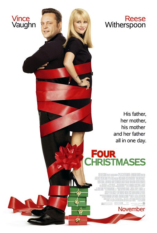
Poster:
This is a Christmas themed romantic comedy I know this due to the use of actors used. I usually see Vince Vaughn in comedy film and Reese Witherspoon in romance film this use of actors gives the reader an idea of the film genre.the use of text on the top with the actors names tells us that they are the main stars of this film.even without watching the film I can tell that the actors are in a relationship.the fact that they are standing back tells us they don't always see eye to eye.the use of the colours red and green fits in with you a Christmas theme.The release date is at the bottom and uses the same colour scheme as the poser it uses a medium font in order to make sure it doesn't attract attention from the significant details. their is also information about companies,directors actors writers,producers and so on.this text is put in dull grey colour that fades into the background.this makes the text seem unimportant in comparison to the other texts.the poster also uses tagline that is repetitive.This use of repetition and a long tagline suggest that the task may take a very long and be tiresome for the main actors.
I chose the film 'The vow' because it contains the typical romantic drama element.The genre of he 'The vow' is a hybrid genre. I came to this conclusion because it contain the convention for a romantic drama.For example romantic music,romantic scenes,conflicts and drama.There are also references to love and marriage The most obvious sign that it is a romance film is the fact that the story is focused mainly on the development of a romantic relationship between two characters.The plot also revolves around an obstacle which prevents love between two people. Thus,making it a romantic drama.The main characters Channing Tatum and Racheal Mcadams are usually seen in this genre of films. Therefore the cast also give us a insight on the films content.The romantic music sets the scene for romance and it is also set in a season valentines day in order to get people in a romantic mood.
Analysing representation
The film producer uses representation features throughout the trailer. He gives one representation of foreigner. This representation is neutral as he portrays them as they are portrayed in the media..Making the action film seem more realistic.The foreign actors use an accented English to let the audience know that they are foreign.The film, Rush Hour is constantly critiqued as being "racist." Many viewers think Chris Tucker's jokes and Jackie Chan's follow stereotypical view portrayed in the media of a black and Asian man.It also gives us a view of how France views Americans.
The action film stereotypically sexualises women.Throughout the film the women are not wearing much clothes.This follows the convention found in an action movie.this under representation causes women to be more likely to be depicted wearing sexy clothing and referred to as attractive in comparison to male characters.Although women are sometimes shown with independence in a movie .they are still portrayed as objects to lust after.They are often the focus of the male gaze with camera effects, mise en scene and use of sound to accentuate their appearance. Jackie Chan is portrayed as a a typical hereo because he carries the conventions needed bravery,pride and strength.However he is not a typical British and American hereo. The fact that the movie manipulates with this convention in order to entertain us with humour. They do this by following the stereotypical views and opinions.They then interpret the Chinese man as someone who is good at martial art and also behaves in a dutiful Asian man.On the other hand John Carter is shown to be a Micheal Jackson loving typical black american.This culture clash causes it to be quite humorous.
For my production assignment we made a magazine which comes free with the I newspaper.The magazine I created here is made with the rule of thirds and visual centre in consideration. I also used many magazine conventions.
Throughout the magazine I used lots of magazine conventions such as.
Title of publication.
Slogan.
Flash.
Cover image.
However I chose not to add the bar code due to the fact it is a free magazine.
The title is written in a bold colourful
font. The title "lucky" suggests that they believe they may tend to
draw good luck. It may also suggest that we are lucky to have such a good
magazine company. This title can mean many things depending on how you
individually interpret the title.
The slogan is short and sums up the
magazines content. It automatically informs the audience that the magazine
talks about shopping and style related topics.
The main focus of this magazine is the
central image. The picture is large so it easily grabs the reader attention.
Amanda Seyfried
facial expression is friendly and inviting. The fact that she is looking
straight ahead makes it feel even more inviting because she is directly
addressing the audience.
The use of fonts make it seem very formal
this suggests the magazine is aimed at older teenagers the layout is quite
obscure due to the variety of font used however it seems engage the readers
interest. The font is manipulated in order to highlight specific points. For example some
of the fonts boldness and colour is changed for effect and emphasis.
The magazine has uses a good consistency
of colours giving it a professional gloss. It uses 4 colours throughout the
magazine cover. The colours used are red ,grey ,black and white. The colour red
modernizes the elegant colours scheme of black, white and grey. The colour red in this
context symbolizes passion, romance and love. This basic colour allow the
audience to focus on the more significant details such as the image.
They advertise free merchandise this
gives the audience an opportunity to win prizes. This helps sell the magazine
because it convinces them that they will gain something by purchasing an
magazine. They use a bold font to make sure we do not miss out on the
competition. This is also a element of free offers. This free offer uses good phrasing in order to emphasise how often they generously give
away products. It does not tell the reader what the free offer will be this just leaves the readers in suspense. This makes
the audience feel curious in order to urge them to buy it.
this magazine features a well known singer called Rihanna .the colour scheme here is fuchsia,grey and black. These colours are elegant and sophisticated.It uses fuchsia to clarify the magazines name and the featured star.it also highlight topics which the magazine is hoping to cover. Q
This magazine shows a image of Cheryl Cole.it uses the colour red to emphasise the word "rock" and the title "q".in the image it shows her licking her spike ring this may suggest the red connotes pain of some such.This magazine also only seems to feature Cheryl this tells the reader that she is the main focus.Cheryl also looks straight at the reader with direct address Vibe
This magazine has a black background that helps emphasise the white coloured title and yellow font.This use of the colour yellow to emphasise the word "new","drake" and "exclusive".Dark colours are used to create a sense of mystery. Their is a good consistency of colours which are used for this magazine to make it look professional. Kerrang!
This magazine features a Emo type of band named panic at the disco.It also features other Emo/Gothic bands such as Paramore and Metalica .The target audience for this magazine are some teenager and young adults.It uses dark colours to give the magazine a dark sinister type of emotion. The Source
The source has a front cover with the rap artist Lil Wayne.It is a hip hop magazine as you can see in its catchy slogan"who got the juice? steroids invade hip hop".It uses the colours red and white.The red shows passion and whites suggests purity.which may narrow down to pure passion.the target audience for this magazine may be young adults. BBC Music Magazine
This magazine has a classical music magazine.This magazine may appeal to a more older audience.it uses more plain colour scheme of white.This connotes that this music is pure and natural.The star that is featured is Sarah Chang who is holding a violin.
In class we have been studying how to target your chosen audience.A target audience is who you aim your product at.We also created a personal profiles who the target audience for teen drama show Waterloo road.here is the personal profile.
Personal profile:Waterloo road
Teenage Waterloo road audiences are considered lazy they also seem to drink lots of energy drinks due to their busy lifestyles.They are also considered fashion conscious this is why they wear well known brands for example Paul's boutique.They are also quite sporty and energetic this is why they tend to wear high profile sport brands.They also like keeping in touch with others via social networks such as Facebook and twitter.They also use several Internet sources may it be their phones or laptops.They are also in touch with new music and Internet trends.